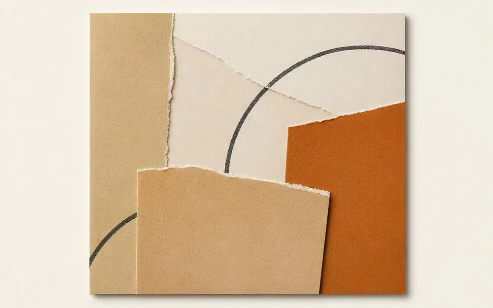
Skincare packaging system
Identity, label architecture and carton artwork built as one reusable kit.
- Sector
- Beauty & wellness
- Services
- Design
- Engagement
- Project
- Scope
- Brand identity · Label system · Carton artwork · Product photography direction
What needed solving.
A boutique skincare brand sold across its own DTC storefront, independent stockists, and third-party marketplace channels with uncoordinated visual rules.
Each new SKU had been designed in isolation, creating shelf disunity and forcing every packaging release to restart the design lifecycle from scratch.
Key Obstacle: Disparate print substrates and inconsistent product variant labeling.
How we worked it out.
- 01
Start from the shelf, not the logo
We photographed the range as it actually appears (in a bathroom, in a stockist's window, as a thumbnail on a listing) and designed against those three views before anything else.
- 02
Fix the architecture first
One label grid, with defined zones for the range name, the variant, the volume and the required legal copy. Variants change colour and one line of type; nothing else moves.
- 03
Choose materials early
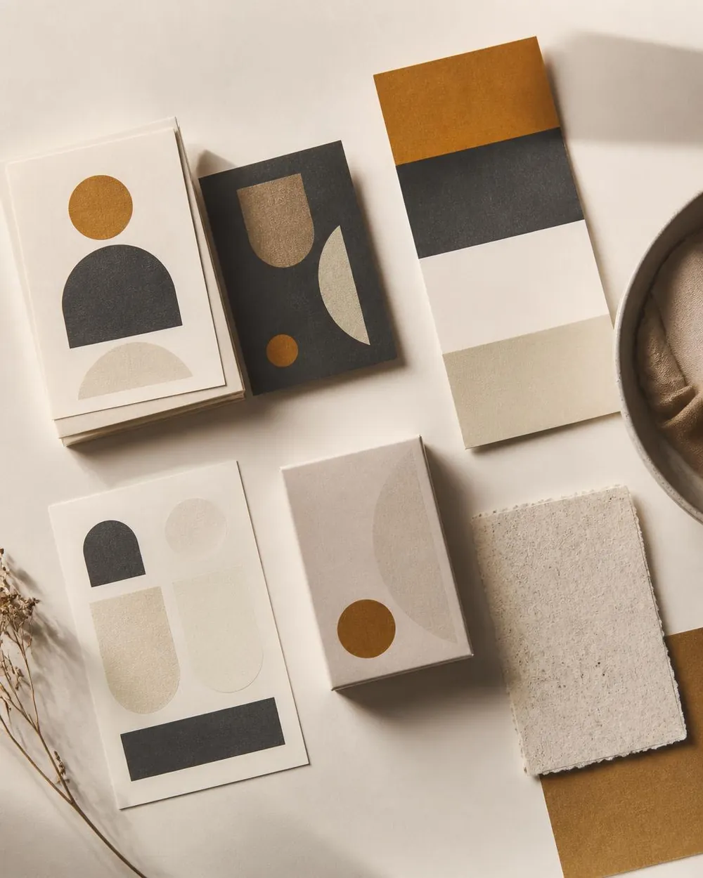
Uncoated stock, a single spot colour and a foil accent were decided at concept stage so the design could be drawn for what the print process actually does.
- 04
Hand over a kit, not a PDF
Master files, a new-variant template and a one-page rule sheet, so the next product does not need a designer to exist.
The delivered assets and systems.
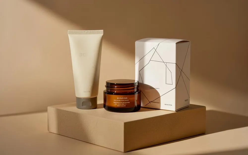
Label architecture system
A unified grid across every bottle and jar size, standardizing variant color accents while locking core brand hierarchy.
Production carton artwork
Outer packaging drawn precisely on die lines, with ingredient panels, barcodes, and foil stamping allowances built in.
Product photography direction
Repeatable camera heights, surface specs, and warm retail lighting angles to ensure future product imagery matches seamlessly.
Self-serve variant launch kit
Working vector masters and production guidelines enabling the internal team to roll out new scents without external design fees.
The details that decide it.
- Type sized for the smallest jar first, then scaled up, not the other way round.
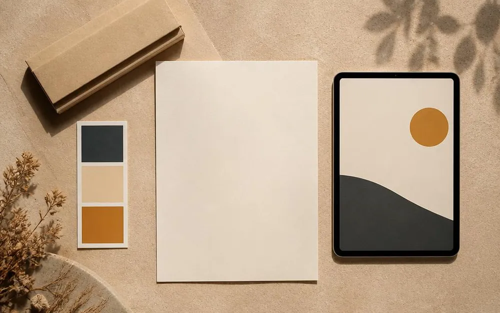
- The accent colour is reserved for one element per pack, so it keeps its meaning.
- Every panel drawn on the die line, with fold and glue allowances built in.
- Contrast checked under warm retail lighting, not just on screen.
Demonstrated Results & Validation
Studio Demonstration: Validated a production-ready packaging kit that cuts variant creation cycle from 3 weeks to under 48 hours without design overhead.
This is a studio concept built to benchmark live architectures and conversational pipelines. On client engagements, these metrics are agreed before kickoff and monitored via analytics dashboards.
- Time to launch a new variant, from brief to print-ready artwork.
- How often the team needs a designer for routine packaging changes.
- Whether the range reads as one brand in a thumbnail-sized listing image.