

Design
The brand that has to hold up once the AI is doing the talking.
When a chat agent, voice line or automated campaign is the first thing a customer meets, the identity behind it can't be generic. We build the branding, packaging and product visuals that make an always-on business still feel considered.
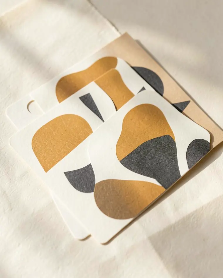
Label design 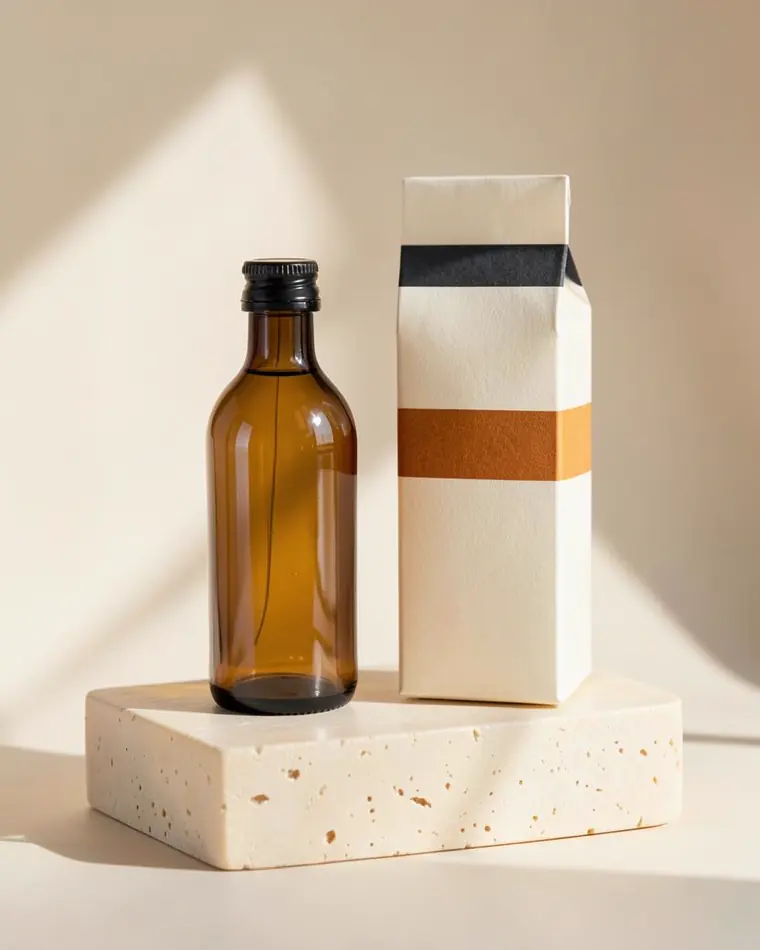
Bottle & carton 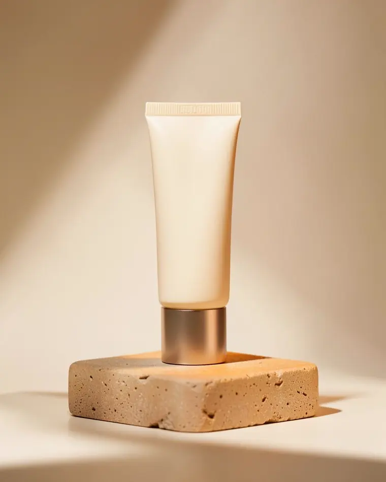
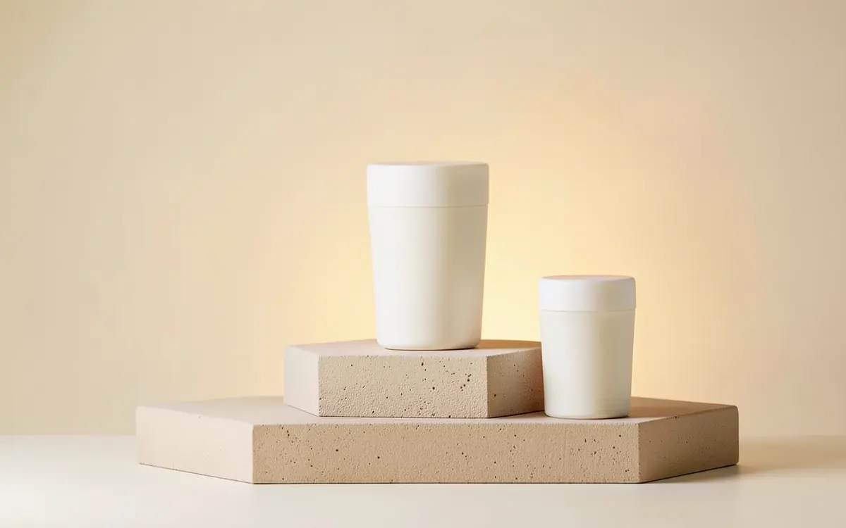
Product hero visual 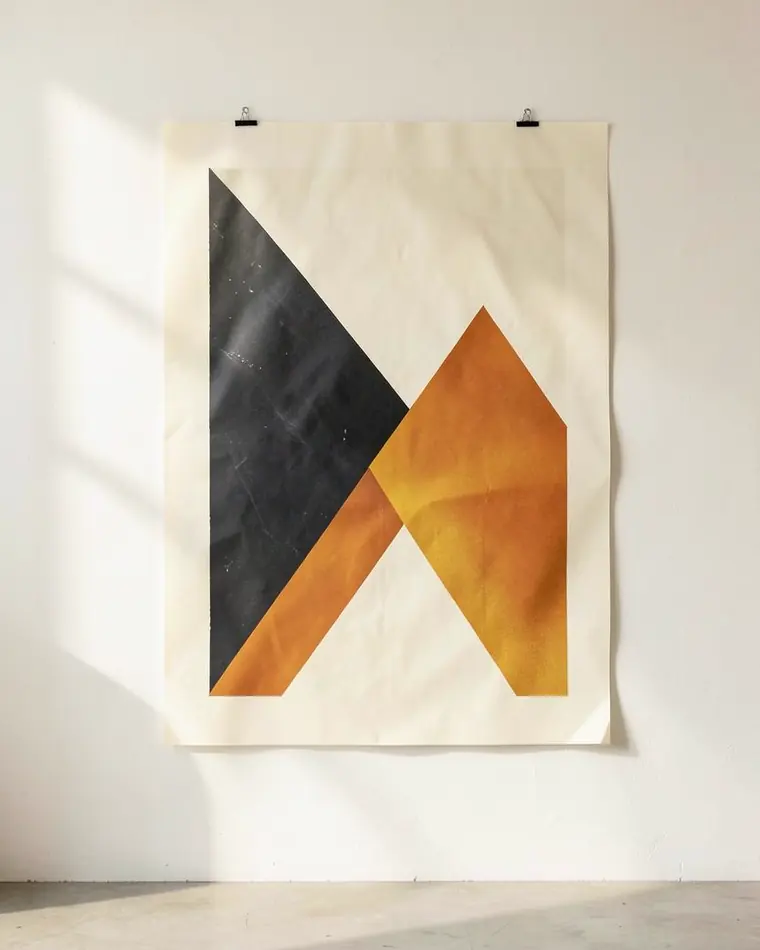
Campaign key visual 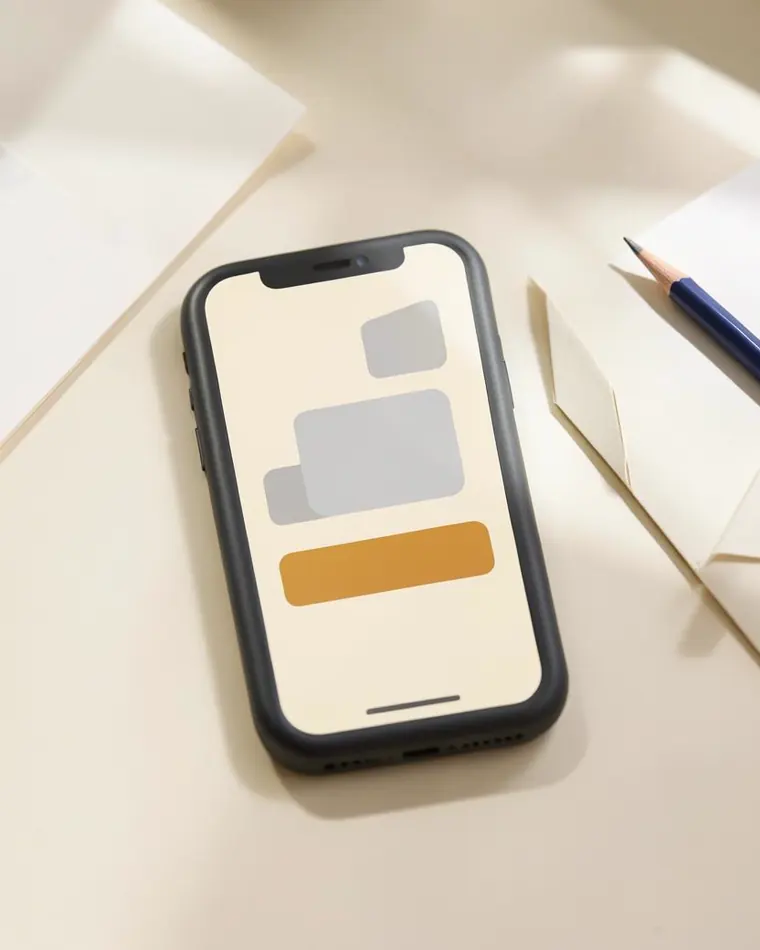
Personal brand 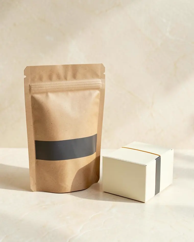
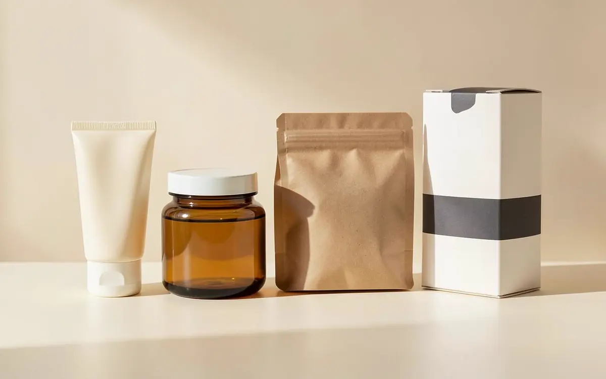
Pouch & box system
The making of
Concept to finished product, one stage at a time.
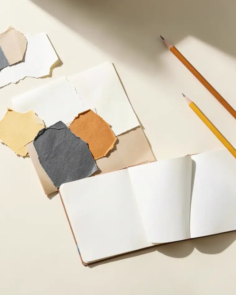
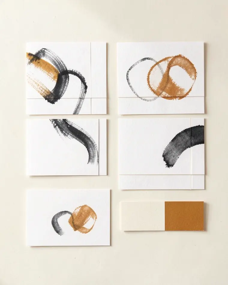
Every project moves through the same six stages, so the brand still holds together when it reaches the shelf.
- 01
- 02
- 03
- 04
- 05
- 06
- 01
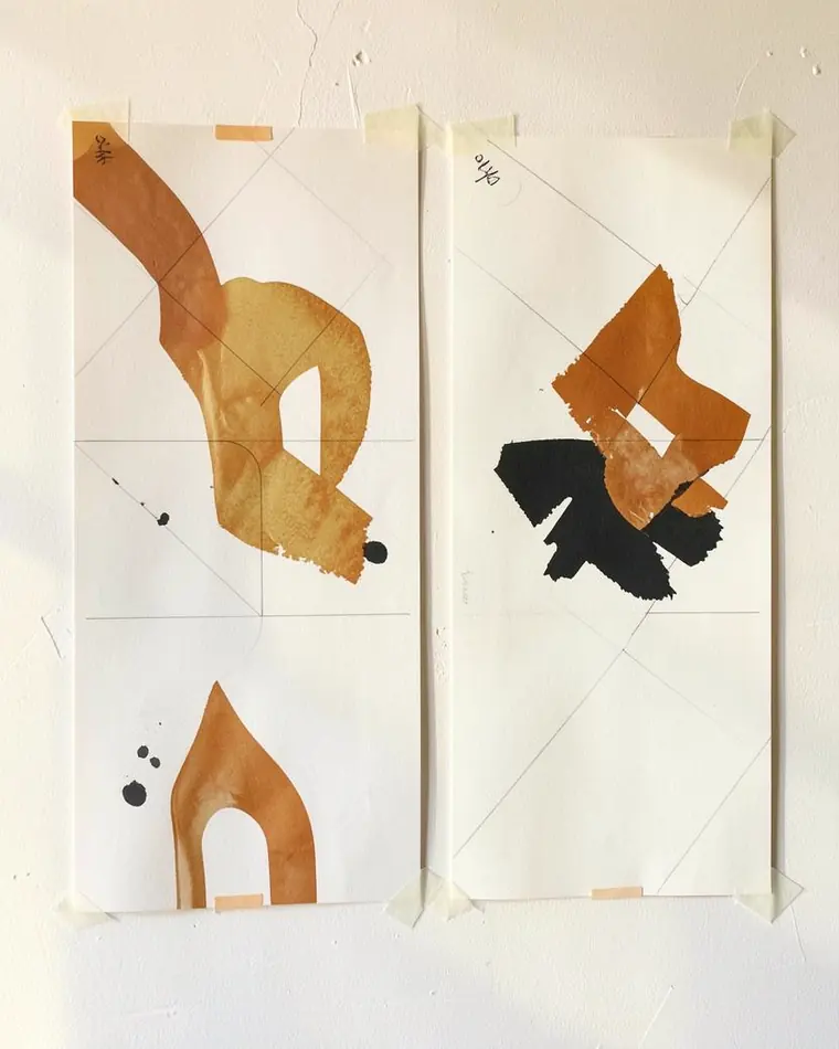
Concept
Positioning, references and the idea the product carries.
- 02
Identity
Type, color and mark: the system everything else inherits.
- 03
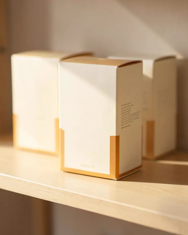
Label
Hierarchy, copy and compliance resolved on the label itself.
- 04
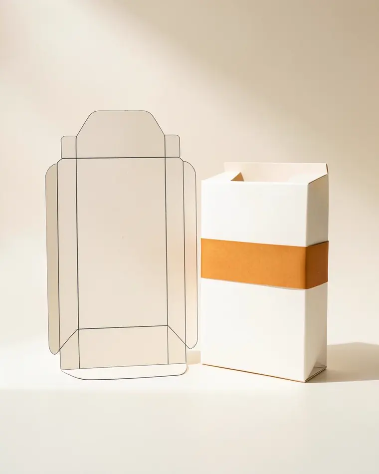
Packaging
Structure, material and artwork built to your printer's spec.
- 05
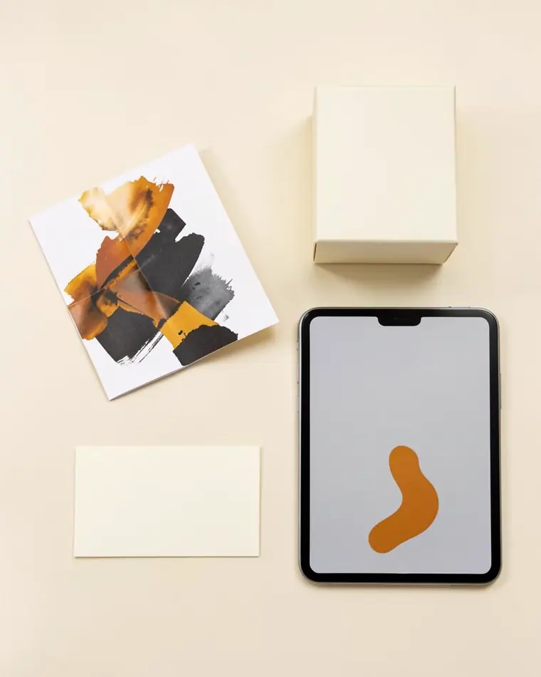
Mockup
The product shown where people will actually meet it.
- 06
Final
Campaign-ready visuals, with every file handed over.
What we make
Six kinds of work, one visual system.
For product brands, founders, startups and businesses rebranding. Each service has its own page with the scope, the steps and what you get.
04
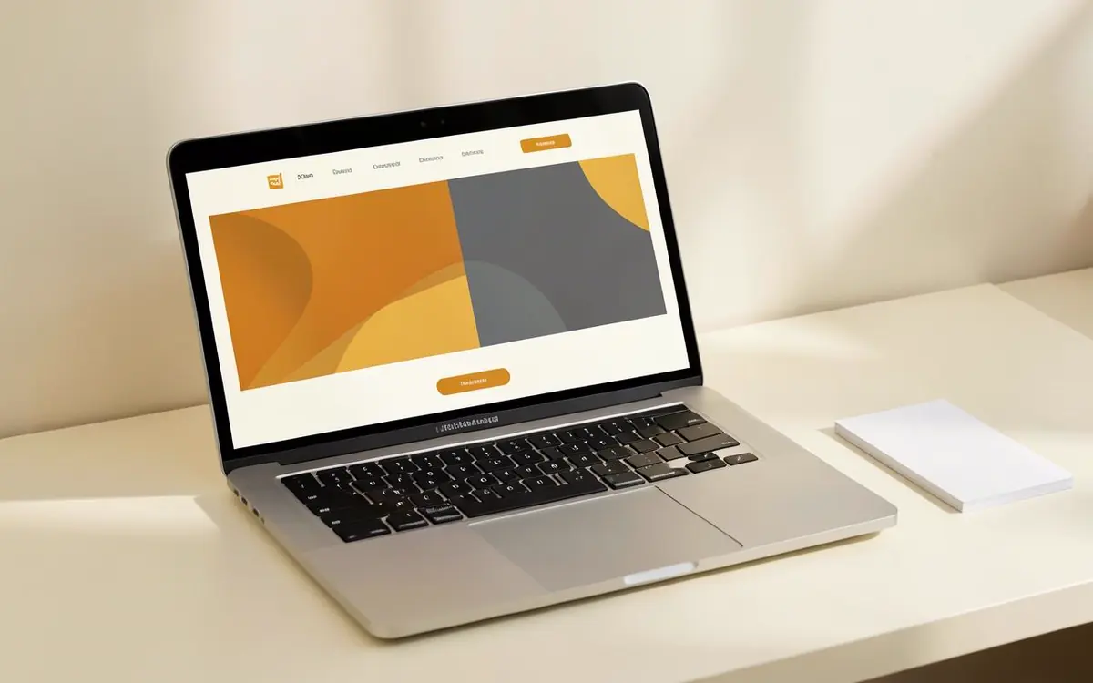
Website Visuals
Hero art, graphics and photo treatments made for your site, not pulled from stock.
Explore
05
Marketing Design
Ads, social posts, emails and decks that stay on-brand from launch to the tenth variation.
Explore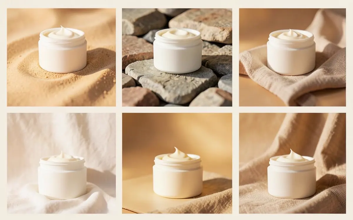
06
AI Creative
AI in the production toolkit for range and speed, with a designer choosing and fixing every frame.
Explore AI creativeHow we work
From first reference to print-ready artwork.
01
Understand
What the brand has to do, who it's for and where people will see it.
02
Plan
Scope and deliverables agreed, then a fixed-fee proposal before work begins.
03
Create
A few directions first, then one system refined until it holds on every surface.
04
Launch
Print-ready files, web assets and guidelines, handed over for you to own.
05
Improve
The system extended as new products, campaigns and pages arrive.
Client work
A brand kit carried from logo to website
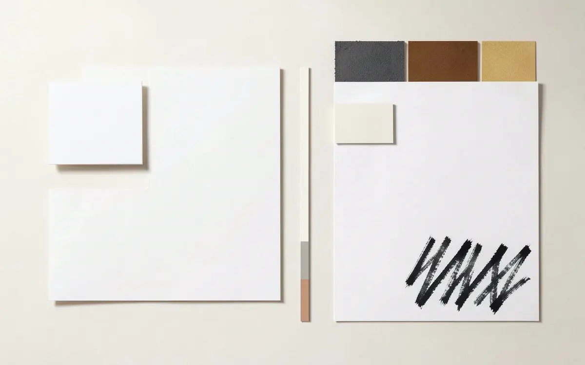
An updated logo, letterhead, business card and pattern, then the site, for a physiotherapy clinic.
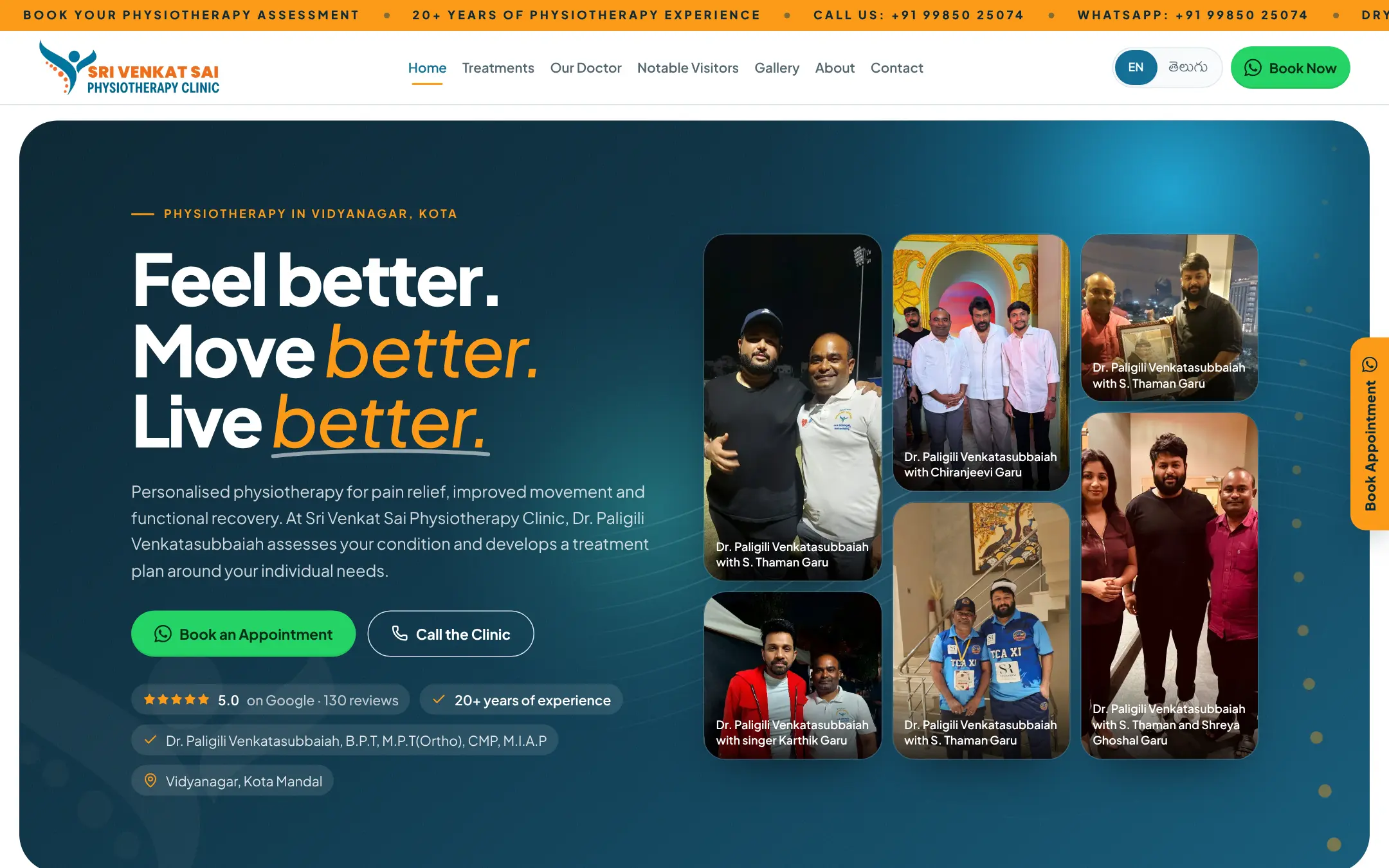
Client project · Healthcare
20–25% increase in clinic calls since the new site went live
“Heartfelt thanks to E82 Studios for designing our clinic website so beautifully and professionally.”
- Web design
- Branding
- SEO, AEO & GEO
- Video
Selected work
Design work
- Studio concept
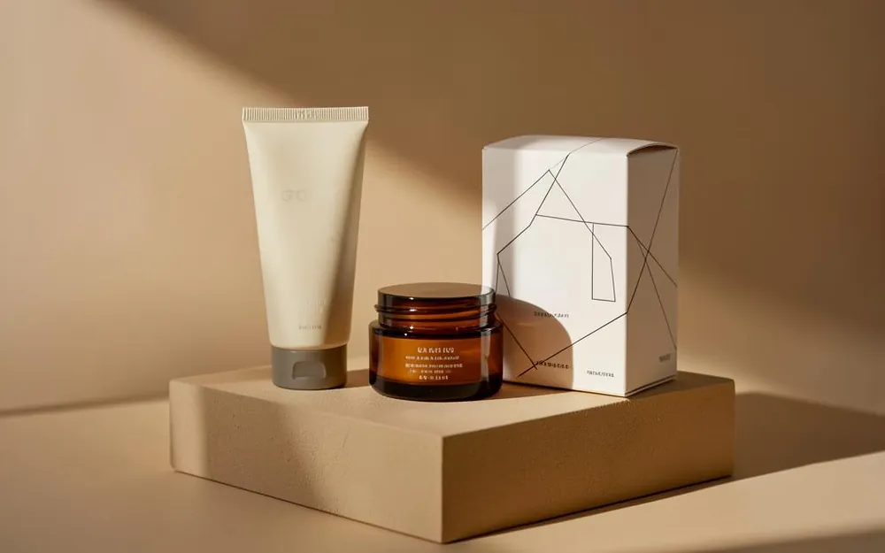
Branding · Beauty & wellness
Skincare packaging system
Identity, label architecture and carton artwork built as one reusable kit.
- Product / experience
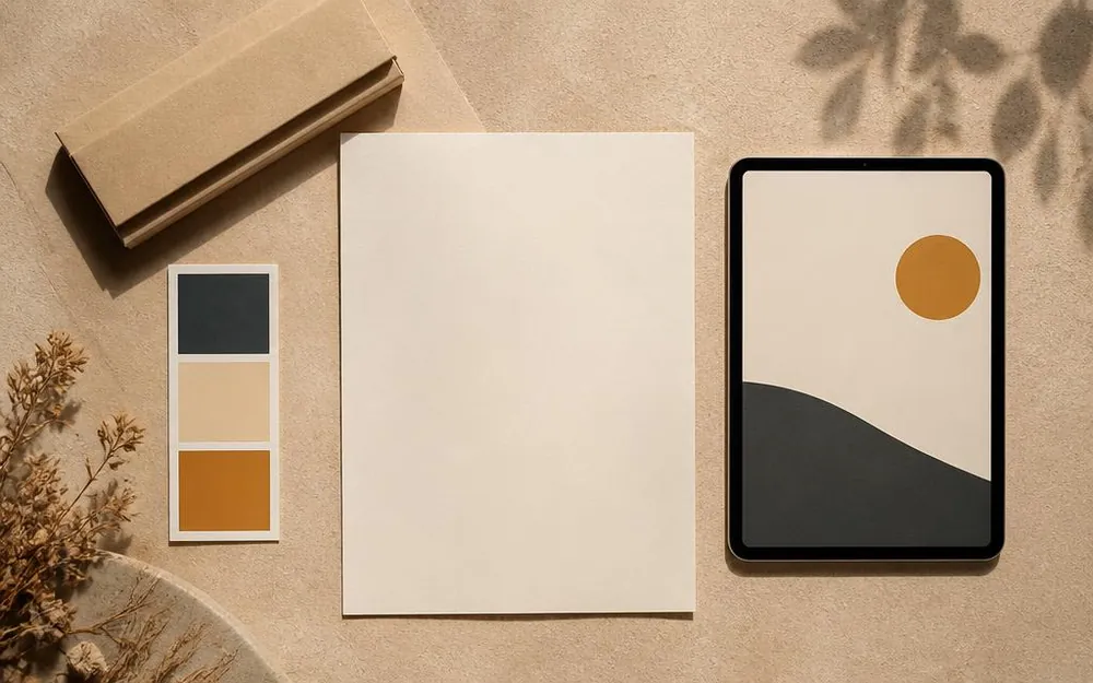
Branding & Web · D2C products
Product launch: identity and storefront
One system carried from packaging through to a storefront built for launch traffic.
Questions
Design questions, answered.
- Can you work from my existing photos or artwork?
- Yes. We regularly build from supplied product photography, packaging art or brand files, and we'll tell you honestly when a source asset isn't strong enough to carry the result.
- Do you deliver print-ready files?
- Yes, packaging and print work is delivered to your printer's specification, with the working files handed over at the end of the project.
- Can you match an existing brand?
- Yes. We can work strictly within existing guidelines, or extend them where the system has gaps.
- Do you do one-off creatives or full systems?
- Both. Some engagements are a single campaign set; others are a complete identity and asset system. We scope to what you actually need.
Ready to make your brand impossible to overlook?
Tell us what you're launching or rebranding. We'll show you what it could look like.
Every engagement gets a fixed-fee proposal before work begins. We reply within 24 hours.
Works better connected:Web Design & Software →AI Marketing →