

A logo is not a brand system
Most brand projects are bought as a logo and used as a system. The gap between those two things is where budgets quietly disappear.
A logo is a single decision. A brand system is every decision that comes after it: what a price tag looks like, how a product photo is cropped, which of two greys a caption uses, what happens to the layout when the headline runs to three lines. A studio can hand over a beautiful mark and still leave a business with no answer to any of those questions, and those are the questions that get asked every week, usually by someone in a hurry.
You can see the result on shelves and feeds everywhere. The mark is fine. The packaging looks like it came from a different company than the website, which looks like it came from a different company than the ads. Nothing is broken, exactly. It just never adds up to a single impression, so it never compounds into recognition.
Systems are made of constraints, not assets
The instinct when a brand feels thin is to make more: more icons, more patterns, more illustration styles, a secondary palette to give people options. Options are the problem. A system gets its strength from what it refuses to do.
The most useful brand systems we build are small enough to hold in your head and strict enough to survive being applied by someone who was not in the room when it was designed:
- One typeface pairing with defined roles: one voice for statements, one for everything else.
- One accent colour with a rule for when it is allowed to appear, so it keeps meaning something.
- A single spacing rhythm reused at every scale, from a label to a landing page.
- One photography treatment: the same light, the same distance, the same surfaces.
- A written rule for the awkward cases (long names, tiny formats, dark backgrounds, third-party templates).
A brand that only works when a designer is holding it is not a brand. It is a mood.
Design the artefacts you actually ship
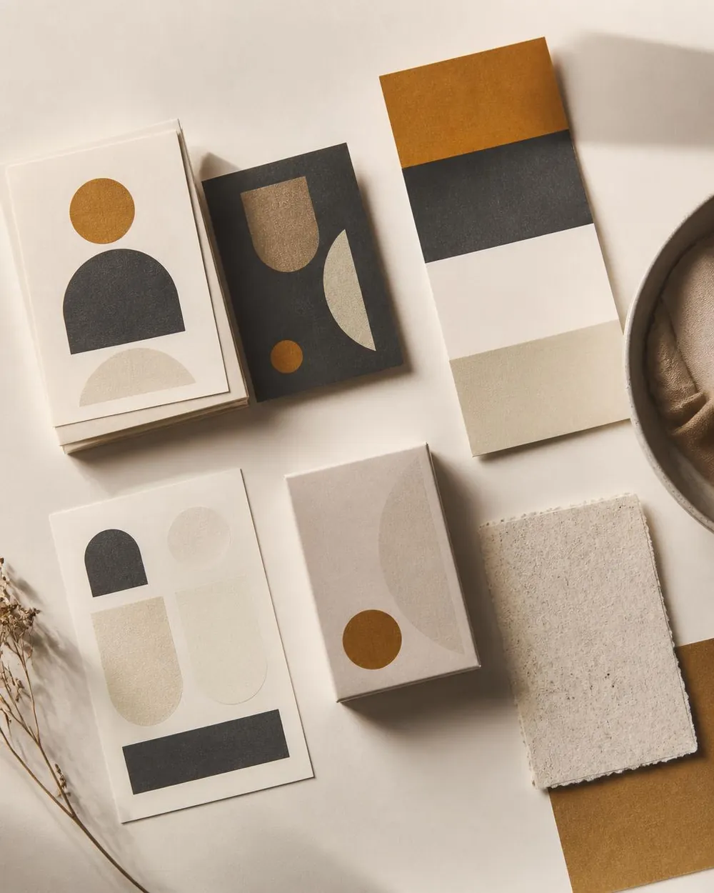
Identity work tends to be presented on ideal objects such as a tote bag, a business card, or a poster nobody will print. Meanwhile the real brand lives on a carton with a barcode, a shipping label, an invoice, an email footer, a marketplace listing whose template you do not control, and a phone screen at arm's length in bad light.
We push clients to name their ten most frequently produced artefacts before any visual direction is chosen, then design directly against that list. It changes the work. It rules out marks that only read at poster scale. It exposes the colour that dies under retail lighting. It forces someone to decide what the product photo does when the packaging is white and the background is also white.
Build for the second year
Launch day flatters everything. A brand looks strong when a small team makes ten pieces in one week with the same taste. The test comes a year later, with three new products, two new channels, a freelancer who never saw the original deck, and a founder editing a slide at midnight.
Designing for that moment is mostly about leaving instructions in the place the work happens: named styles in the files people open, a component for anything that repeats, a short document that answers questions rather than describing philosophy, and source files organised so the next person can find the master rather than a copy of a copy.
None of that is glamorous, and none of it shows up in a case study. It is, however, the difference between a brand that gets stronger every time it is used and one that has to be rescued in eighteen months.
What to ask for
- 01
Ask for the rules, not just the files
Colour, type, spacing, imagery and tone written plainly enough for a non-designer to follow.
- 02
Ask to see the ugly cases
The longest product name, the smallest format, the darkest background, the third-party template.
- 03
Ask how it gets used without you
Templates and components for the artefacts produced most often, in the tools your team already has.
- 04
Ask what happens when it grows
A new product line, a sub-brand, a second language: the system should already have an answer.
A logo is worth having. It is just the smallest part of what you are buying, and the part that does the least work once the launch is over.
Working on something this applies to? We're happy to look at it with you.
Keep reading
Have something worth building?
Tell us what you're trying to launch, improve or automate.
We reply within 24 hours.