

Clarity, trust, action: what a homepage owes a visitor

A homepage has about one screen to answer three questions. Most sites spend that screen on adjectives.
Someone lands on your site from a search result, a link in a message, or an ad they half-remember clicking. They are not reading; they are triaging. In the first moments they are working out what this is, whether these people are credible, and what happens next. Clarity, trust, action: in that order, and the order matters. Nobody acts on something they do not trust, and nobody trusts something they do not understand.
Clarity is a sentence, not a mood
The most common failure we see is a hero section that describes a feeling instead of a service. "Empowering ambitious teams to unlock their potential" could be a recruiter, a gym, a consultancy or a productivity app. The visitor has to scroll to find out, and scrolling is a cost they may not pay.
The fix is unglamorous: say the thing. What you make, who it is for, what changes for them. A plain sentence at the top of the page reads as confidence, because only people who are unsure of their offer hide it behind abstraction.
If your headline would still make sense with a competitor's logo above it, it is not a headline. It is decoration.
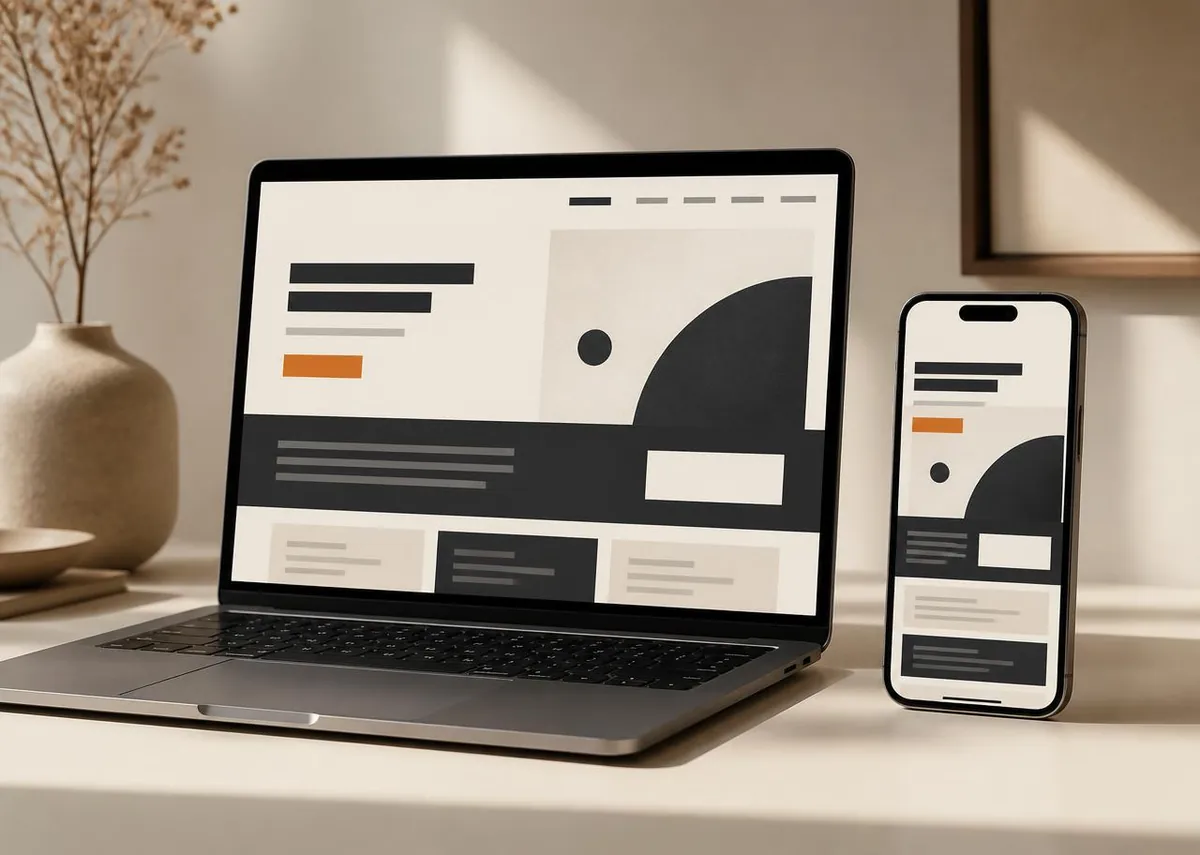
Trust is built from specifics
Trust is not a badge row. It comes from detail that would be expensive to fake: how you actually work, what a project costs in broad terms, what you will not take on, real photographs of real things, a phone number that belongs to a person, an answer to the awkward question before it is asked.
It also comes from craft. A page that loads instantly, holds still while it loads, and responds the moment it is touched signals competence before a word is read. The reverse is just as true: layout that jumps, a menu that fights the thumb, and a form that loses what was typed all say something about how the rest of the work is done.
- Show the process, not adjectives about the process.
- Answer price honestly, even if the answer is a range and the reasons behind it.
- Put the objection on the page: vagueness reads as evasion.
- Use your own imagery. Stock photography is a trust tax.
- Make the contact route obvious from every screen, not just the last one.
Action needs one obvious next step
Pages with five equally weighted buttons are not offering choice; they are outsourcing a decision the site should have made. Pick the one action that matters most, give it the strongest visual treatment on the page, and let everything else be quieter. A secondary route can exist for people who are not ready; it just should not compete.
Then reduce the cost of that action. Every extra field, every mandatory dropdown, every "tell us about your project" box with no prompt is friction paid by the person you most want to hear from. Ask for what you genuinely need to reply well, and nothing else.
Design the journey, not the page
Clarity, trust and action are not three sections stacked at the top. They repeat at every depth of the site. A service page restates the claim in its own terms, proves it with the detail relevant to that service, and offers the same next step. A case study does the same. So does a pricing page.
- 01
Say what it is
One sentence a stranger can repeat accurately after reading it once.
- 02
Show why it is believable
Specific, checkable detail: process, artefacts, craft, people.
- 03
Make the next step easy
One primary action, present wherever the decision might be made.
- 04
Remove everything that does not serve those three
Most redesigns improve more by subtraction than addition.
A site built this way tends to look calmer than its competitors, which is often mistaken for having less on it. It usually has less on it. That is the point.
Working on something this applies to? We're happy to look at it with you.
Keep reading

Have something worth building?
Tell us what you're trying to launch, improve or automate.
We reply within 24 hours.